
In this edition of Pixel Talk I will be looking at the differences between the International and Japanese box art released for Power Quest on the Game Boy Color or Gekitou Power Modeler as its known in Japan on the Game Boy.
Before we get into the article you might have noticed that this Pixel Talk edition is not based on a random game like the previous Twilight Princess or Altered Beast articles I’ve written – and if you read those then you might have noticed I am not a skilled writer…but I do know a few things about art at least…that makes it better right? So I’ve decided it would be a good idea to make these more of a supplemental addition to our regular episodes when written. We just released our Power Quest episode not too long ago and in doing research for it I noticed a big difference in the box artwork released for this game. And having really enjoyed the title I thought this would be a good opportunity to start pecking away at the keyword again stumbling through my thoughts from an art perspective. I won’t be talking about the story or game play at all. If you want to know more about that, make sure to give the episode a listen.
 As you can clearly see these two designs feel very different from the first glance. On the left we have the International release and on the right we have the Japanese only release. I want to start by saying that I usually am a big fan of Japanese box art over the North American versions in a lot of cases and this is a perfect example of this. Quickly I will run through some pros and cons for my opinions for each design…maybe even some quick sketches and mock ups for examples.
First up is the Japanese box art release…Gekitou Power Modeler did come out first after all.

The first thing you notice about this version of the box art is, probably bright red border. If you can imagine this sitting on a store shelf this color might just scream “LOOK AT ME!” to you. Japanese game stores are notorious for being filled floor to ceiling with games so this bright color choice is always a good tactic if you want to engage you target audience. It might be your best bet to at least get your foot in the door toward a possible sale.
Next I want to point out is the logo.  They decided to place it in the bottom center, showing Max’s face above the text. The logo matches the game’s title screen (shown right) and this has always made me feel like the game wasn’t thrown together at the last second.
The real eye candy of this image is the two robots fighting. Once again we see Max fighting another robot named Axe. Having Max appear in the logo and then reappear for the main image is good to establish a main “hero type” character and by pitting him against the evil looking Axe works well to make Max feel like that hero. Axe has a bit more of an sinister robot feel, both in look and color, so it makes sense to have these two represent the game. Axe is not necessarily an evil character but that doesn’t matter for box art. Moving on, I think the biggest thing this image does is really sets up what kind of game this could be as soon as you look at it. You have two robots fighting each other, so its not a stretch to think “Hey is this a robot fighting game?” leading you to actually pick up the box, flip it over and check.
Lastly for Gekitou Power Modeler I want to quickly mention the cool background that you can see behind the fighters. I love blueprint/schematic drawings of robots and machinery so I think this looks really cool. Aside from looking cool though it helps make the connection that there are more robots than just these two shown fighting. Hopefully this makes you want to check out the game even more, for me it totally did. Although I think this is a very good looking design I do have a few minor gripes that I think hurt some of the more dynamic aspects of the artwork.

I think the characters being cropped by the red “window” makes them feel a little stuck on or halts there movement so I would’ve liked to have seen them break that window frame (mocked up above to show what I mean…notice the feet I drew!). Also I know the red color really draws the eye but I think it drowns out the red in the logo and the red in Max. I think another color choice might still have drawn your attention while simultaneously boost the logo and fighter. Really other than those minor gripes I like this design a lot.
Now on to the International release which has been renamed Power Quest…strike one from the start, what a generic sounding name.
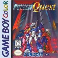
Okay, so I understand Gekitou Power Modeler was going to need a bit of a name change before the world could get on board. I can see where Power Quest came from and possibly what they were going for by choosing that name but I think it was a miss. I believe the quest part of Power Quest was aimed at the RPG element to the game because the title feels like a generic RPG. It makes sense, its just not interesting. I personally would’ve like it as Power Modeler or Fierce Fighting (the Gekitou part) Modeler…that sounds cool to me…Fierce Fighting Modeler. This hints at the fighting aspect and the fact that they are small remote controlled robots. I don’t know about you but as a kid I would’ve went ape shit over a remote controlled fighting robot!
Now that we’ve got the terrible name of the International release out of the way, what the “F” is up with that font?! This adds even more of a last minute/thrown together feel for this release. Why choose two totally different fonts with totally different feels? The only thing they have in common is there crappy faux shines, different styles of shines but crappy shines none the less. This leads into the title screen (pictured right)…its totally different than the box art. Its waaaaaaaaay better than the box art logo too! It has one font which it an improvement and once again you see Max above the logo. This time he looks much more humanoid than the Japanese version, like Bryan pointed out in the episode but the layout is very similar. I think this would’ve made a much better logo for the box art. To illustrate this point I did a few quick mock ups swapping out the logos. First I just swapped the logo with the current layout that was released. Then I played with the placement of the illustration, logo and colors. After that I ditched everything but the text from the logo. And finally I just did a complete redraw of the cover based more on on the Japanese design but using the International character color and the Super Game Boy bezel art for inspiration.
 I don’t think the International box art illustration is terrible, but at the same time I don’t think it is anything special either. I have issues with the perspective of the buildings because they don’t seem to match the perspective of the characters. I don’t think the grouping or pose of the characters says anything about the game or fit the fun mood of the game. The buildings also seem to feel much more like a futuristic setting rather than the small rural town the game seem to take place in. Why can’t game box art in North America be fun like in Japan? This is a game that children and their robots are the main characters of the story.
My goal wasn’t to shred the International release, I am harsh on it out of love for the game. I think it deserved better box art which in turn could’ve helped the game get into more homes. When it all boils down my biggest criticism is with the terrible logo chosen but I think the Japanese box art was far better suited for this game.
I hoped you enjoyed the read and my thoughts. Thanks for reading! – James
Pixelated Audio – iTunes website facebook twitter
Jame Brunner Artwork – manovermars.com
I like the first image you showed of Power Quest just below the Japanese art-work. Certainly got that Mega Man Look and feel to the design.